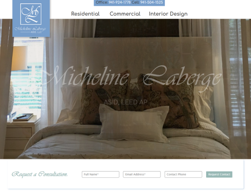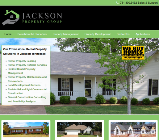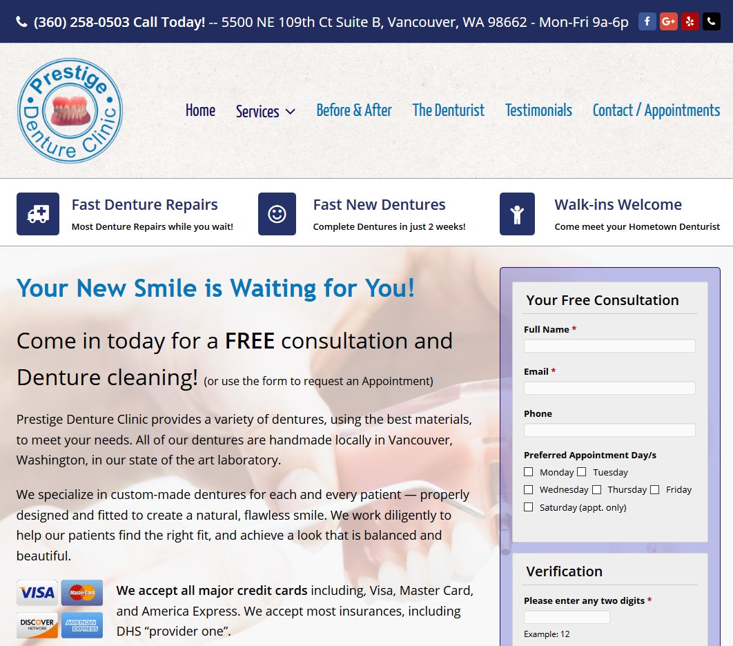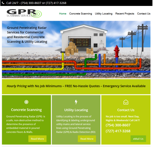
Welcome to Lead Web Designers
Professional Website Design & CMS Development W3C Compliant solutions for small to mid sized Businesses with more Functionality than you’ve ever seen in websites before. Since 1992 we’ve helped Small Business Owners become successful Online!
It’s What We Do Better!
The Key to Our Success? – We Respect Our Clients!
Unlike many other businesses, we think Customer Support is the secret sauce. It’s the little things like when you call Support and they instantly Assume it’s YOUR fault whereas We assume it’s just a system setting and we figure it out without abusing or demeaning you. Or they add a language barrier in the hopes you’ll get frustrated, give up and live with it.
We NEVER outsource our Support! We WANT to talk to you!
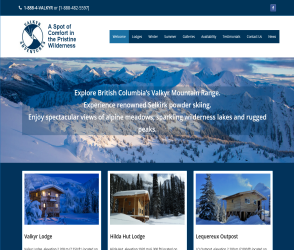
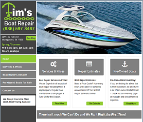
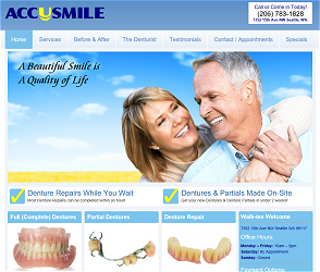
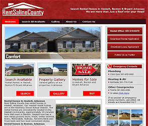
Smart Mobile Responsive
There are 2 versions often used when building a Mobile Compliant website, Compatible (or Friendly) and Responsive. Compatible simply mashes your website down where Responsive reads the visitors device settings and Rebuilds your site instantly to fit their specific screen exactly. Obviously Responsive is the most expensive and eventually, the only choice.
We don’t charge you more for Mobile Responsive Website Design!
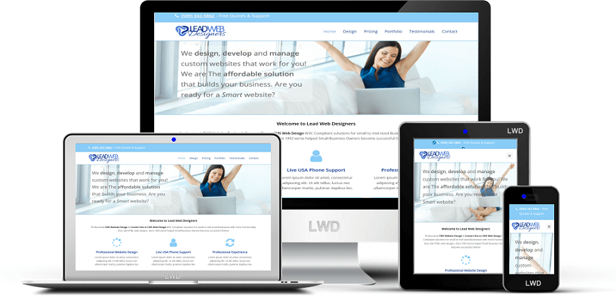
* Responsive CMS Design
Our cms website design is Cross browser compatible, Mobile Responsive, Disabled visitor compatible. Custom CSS3 & HTML5 for perfect Mobility on ANY device.
* Website Design SEO
Our CMS Designs are Very Optimized “out of the box” dramatically increasing your Search Engine Rankings Fast. Optimized by our Professionals to Target your exact keywords!
* CMS Design Maintenance
HTML5 long term viability is upwards of 10 years whereas old HTML3 is 2 years Maximum. You are no longer Required to rebuild your website every couple years!
* We Are Here for You!
We take care of the whole cms web design & installation process for you, even Website Hosting and we can even help you brainstorm for a Domain Name. Free Life-Time support so you are never alone.
* CMS Website Design ROI
Compared to old HTML websites, CMS Website Design is more affordable in both setup and maintenance Costs allowing for exceptionally quick return on your investment. No other marketing spend compares!
* Website Design Fees
We are “Flat Fee” web designers which means NO weird Hourly charges. We’ll tell you the Costs upfront with No surprises later. We ask for half down to get in our schedule with the last half due at completion. 3rds for larger projects.